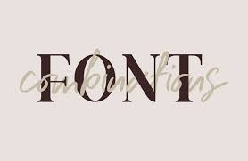
There are thousands of typographical fonts that can be used on a banner or other document. Not all are going to offer a professional look. In some instances, a font can completely alter the way that a client or potential employer views you. Knowing the top fonts will help you to choose one that is not only easy to read but also widely accepted.
Why is the Font Important?
The font can tell a person a lot about who you are and what you’re trying to achieve. You have to set the right tone, and if your font has too much decoration, it can take away from your professionalism.
Your font should be:
- Easy to read
- Capable of holding the attention of the reader
- Attractive
As you look at the fonts, you’ll notice that there are serif fonts and non-serif fonts. A serif is sometimes referred to as having “feet.” They’re the decorative strokes that are found on the steps of certain letters, like an F or a T. Many believe that a serif font is easier to read because the letters are more distinctive.
Much of it comes down to how you’re planning to use the font, how large it will be printed, and how far away people will be when they read it.
Unless you work for a company that dictates the font that you must use or you’re submitting a paper to a particular publisher, you have the freedom to choose the font that you want to use.
We’ve identified the top 11 fonts that are used for professional purposes.
Top Fonts to Use
Each font has a unique look and a reason for it to be on the list. Whether you’re using the font for a resume, a banner, or for some other professional use, consider the message you want it to send.
1. Helvetica
In recent years, Helvetica has risen to the top to be the most-used font by professionals and media designers. The letters are easy to read when typed out normally, in italics, and in bold. It has become a popular choice in all areas of graphic design, particularly in logos.
For those who don’t want to use a serif-based font, Helvetica is a popular choice. It’s also important to note that there is a 2019 version known as Helvetica Now. The main difference is that the newer version offers looser spacing to offer more readability.
2. Arial
Arial has quickly become a popular font because it is easy to read without having any serifs in place. The letters are well-defined, ensuring that they can be read quickly and effectively. The kerning (the spacing between characters) is sufficient so that the letters don’t start to run together.
3. Times New Roman
Times New Roman is the default font in many different word processing programs. Additionally, it is a widely accepted font with publishing houses. It is considered to be a “conservative” font, due to the presence of the serifs as well as the overall size of each letter. It ensures that it’s a recognized font without being too bold in the statement that you wish to make.
4. Garamond
Garamond is a popular font, and it has been around in one form or another since 1989. Book and magazine publishers are fond of using it because it holds up well in long bodies of text. While there is a serif in place, it is not found on every letter, offering a compromise for those who do and don’t like to use serifs.
5. Futura
The Futura font is identified to be geometric in shape with nearly perfect circles in many of the letters. Particularly when small font is required, Futura is very easy to read. It is commonly used in books, large displays, and corporate typefaces.
Generally, people either love or hate Futura. Some people believe it to be efficient while others believe it to be too forward and assuming.
6. Calibri
Many people are familiar with Calibri because it became the default Microsoft font a few years ago, replacing Times New Roman. It is considered universally readable because the kerning is sufficient, and the letters are shaped sufficiently to be legible without the use of serifs. The type is also requested by many publishers when requesting digital documents because of how easily it renders on computer screens.
7. Trebuchet
Trebuchet is a bold design that looks similar to Times New Roman but has been stripped of its serifs. It appears well on the screen but has a textured look. It ensures that it is capable of looking professional while also offering a modern touch in comparison to some of the fonts that have been used and over-used in business documents.
8. Cambria
Cambria is a font that’s been around since 2004. It’s legible at all sizes, whether it’s on the screen or printed. It is commonly found on Microsoft templates, so it is often used in resumes and cover letters. Although it’s a relatively new font, it is considered “traditional.”
9. Book Antiqua
Book Antiqua has long been considered an alternative to Times New Roman, particularly when trying to read it easily on a computer screen. It is based on a classic Palatino font and is distinctive on its own. It’s a readily available font on all Microsoft machines, too, ensuring that anyone reading it online will be able to see it in the way it was intended.
10. Rockwell
Rockwell is a font that has a look inspired by what came off of a Litho Antique typewriter. The history of the font dates back to 1910, and the design has been redesigned and revived several times throughout the early 1900s. There are large serifs on each of the letters, ensuring that they offer a significant amount of character.
When you’re searching for a professional font that is vintage inspired, the Rockwell can serve well when typed out in all sizes. It can be effectively used as a font for the body of a document as well as for a logo or for a header.
11. Soho
Soho is a vibrant font that is bold with small serifs to help distinguish between the letters. Additionally, there is ample space between the letters, ensuring that the letters will never collide, regardless of the size of the font that is chosen.
Soho was designed by renowned type designer Seb Lester. The goal of this particular font was to ensure that it was legible in modern media. It is large, simple, and easy to read. While it may not be ideal for large blocks of text, it is excellent when calling attention to a single word or line of text, particularly with titles or headlines.
Putting the Fonts into Place
Placing fonts takes some time – and you may want to try out a few to see which ones have the most impact on your project. Generally speaking, you don’t want to use too many fonts as it will lead to confusion.
Choose no more than three fonts. This will cover the header, subheader, and body of a document. If you’re using the fonts for a marketing banner or brochure, the various fonts can call attention to a special or a company motto – but again, limit the fonts to keep it simple and focused.
Once you’ve chosen the fonts that you wish to use, it’s time to get your documents, banners, or other media to print. At Custom Printing, we offer premium digital and wide-format printing to ensure you get the quality print job that you need. Contact us today to get a quote.


